Physical Address
304 North Cardinal St.
Dorchester Center, MA 02124
Physical Address
304 North Cardinal St.
Dorchester Center, MA 02124
The way customers are viewing your website is evolving every day.
The only way to see a website few years back was through a desktop or a laptop with a large screen. Websites had to be designed for only large screen sizes. This has drastically changed. Customers have devices of various sizes — mobile phone, tablet or laptop — and will consume your website on all these devices. It becomes practically impossible to have different versions of the website for all these different sizes.
To solve this we need to build responsive WordPress themes which should be able to respond to various sizes automatically. This can be done by using a mix of flexible layouts, images and using CSS media queries so the same WordPress theme can respond to different sizes of devices.
CSS media queries make it easy and practical build responsive WordPress themes.
CSS media queries are highly useful to change the properties of your website based on device properties.
One of the simplest forms of media query is to have different styles for screen and for print.
[html]
<link href="printstyle.css" type="text/css" media="print" rel="stylesheet"/>
<link href="screenstyle.css" type="text/css" media="screen" rel="stylesheet"/>
[/html]
The above code helps to have different style sheets to be loaded based on if it is a printer device or a screen device. With the above tags for a print device printstyle.css will be loaded and for the device which has a screen screenstyle.css will be loaded.
Media queries let you even add more conditional styling based on other parameters like device width.
So you can have styles for a screen device and you want to override or provide extra styles for mobile devices you can load those styles using the following tag:
[html]
<link href="mobilestyles.css" type="text/css" media="screen and (max-device-width: 480px)" rel="stylesheet"/>
[/html]
The above code will load mobilestyles.css when the media is screen and max width of the device is 480 px. Similarly, you can add different styles if you want to devices of different sizes and make your site responsive.
Based on the media query, you will have a set of styles which will be common for all screen sizes. Then you will use media queries specific to the devices your site has to cater to and override any specific styles you want to be different for different screen sizes.
Following are some example template of the media queries for standard screen sizes:
[css]
/* Common general styles go here */
/* Mobiles in Potrait mode */
@media only screen
and (max-width : 320px) {
/* Add you style here */
}
/* Mobiles in landscape mode */
@media only screen
and (min-width : 321px)
and (max-width : 480px) {
/* Add you style here */
}
/* Tablets */
@media only screen
and (min-width : 768px)
and (max-width : 1024px) {
/* Add you style here */
}
/* Desktops and laptops computers */
@media only screen
and (min-width : 1224px) {
/* Add you style here */
}
/* very large screen devices */
@media only screen
and (min-width : 1824px) {
/* Add you style here */
}
/* For print */
@media print {
/* Add your style here */
}
[/css]
In the above code we have we have a section where you will add all the general styles for your site. Then in case you want your site to have a different style for mobiles you will add it in the section for mobile devices. Similarly, you can override the styles for tablets and larger screens. The above list is not exhaustive and will change on the list of devices you are planning to target for your site.
Let’s try out some media queries in WordPress. First, create a child theme of TwentyTwelve. Then we will add some media queries to alter the behavior of our site.
To create a child theme in your create a new folder for your theme in your WordPress installation as follows:
wp-content\themes\twentytwelvechild
Then create a style.css file in it with the following content
[css]
/*
Theme Name: Twenty twelve child for media queries
Theme URI:
Description: Child to demo medi queries in WordPress
Author: Chris Musial
Template: twentytwelve
Version: 1.0
*/
@import url("../twentytwelve/style.css");
[/css]
Your folder structure should look as follows:
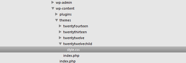
The above code creates a child theme with the base theme as TwentyTwelve. Import the css from the base theme. Incase all has gone right you will be able to see the child theme in your WordPress admin and enable it as shown below.
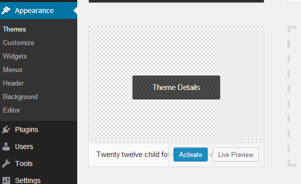
After activation, the site will exactly look the same. (But keep reading on.)
Some of mobile browsers like Safari on iPhone have a much larger viewport than the actual device site. This is actually done to display sites which were designed for desktops to also be displayed properly on iPhones. Since we are going to change styles and take care of display on different sizes we need to tell the browser to keep the viewport same as the actual device width.
This can be done with the help of the following meta tag
[html]
<meta name="viewport" content="width=device-width" />
[/html]
We will need to add this tag in header.php .
(Note: TwentyTwelve already has this. In case your base theme does not have this tag, make a copy the the base themes header.php in your child theme folder and add this tag. This is necessary for media queries to work properly.)
Let’s see the media query in action. If you want to change the background color and font of your content only when mobiles are in landscape mode and for tablets you will add the following code to your style.css:
[css]
/* Mobiles in Potrait mode */
@media only screen
and (max-width : 320px) {
/* Add you style here */
}
/* Mobiles in landscape mode */
@media only screen
and (min-width : 321px)
and (max-width : 480px) {
/* Add you style here */
.site-content {
font-family: Georgia;
background: red;
}
}
/* Tablets */
@media only screen
and (min-width : 768px)
and (max-width : 1024px) {
/* Add you style here */
.site-content {
font-family: Georgia;
background: red;
}
}
/* Desktops and laptops computers */
@media only screen
and (min-width : 1224px) {
/* Add you style here */
}
/* very large screen devices */
@media only screen
and (min-width : 1824px) {
/* Add you style here */
}
[/css]
Here we override the style for .site-content when the device is a mobile in landscape mode or the device is a tablet.
So now if we change the size of the browser window so that it is it is greater than 768px and less than 1024px the styles for tablet will be overridden and you will see that the background and font as changes as seen below.
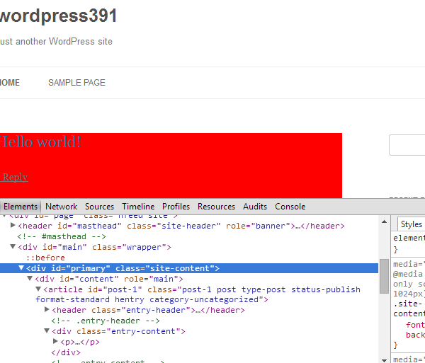
If you now decrease the browser window size below 320px the general will again kick in and the background will not be red.
Similarly, you can override specific styles based on the requirements of your site and devices you want to support. Some examples could be hiding the sidebar on smaller devices screens reducing margins etc.
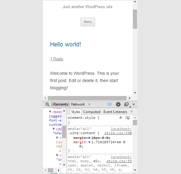
In today’s world it is necessary to know the possible devices which could be used to access your site. By using media queries you should override any style or behavior which you want different when your site is accessed by a device of a particular site.
Media queries make it simple to customize your WordPress theme so that it can render itself appropriately on devices of different sizes. Have fun while using media queries in your next WordPress theme.