Physical Address
304 North Cardinal St.
Dorchester Center, MA 02124
Physical Address
304 North Cardinal St.
Dorchester Center, MA 02124
The footer in WordPress, or for websites in general, is one of the least used pieces. The footer is mostly used to show credits and contact information. This might be good enough for many sites, but it would be better to make the footer in your WordPress theme much more configurable. It might be better to widgetize the footer so that you can easily add different kinds of widgets to it.
If you decide to widgetize your footer you should also have to take care that the footer still remains responsive and the content is properly displayed even on smaller screens. For this you might have to dynamically rearrange the footer widgets on smaller screens.

In this article, we are going to see how we can make the footer responsive using media queries.
To make our WordPress footer responsive, let’s start by creating a child theme of twentytwelve. To create a child theme of twentytwelve create a folder wp-content\themes\twentytwelvechild and in that add a style.css with the following text:
[html]
/*
Theme Name: Twenty twelve for responsive footer
Theme URI:
Description: Child theme to demo responsive footer
Author: Abbas S
Template: twentytwelve
Version: 1.0
*/
@import url("../twentytwelve/style.css");
[/html]
In the above code you have just specified the meta data for your theme like its name version, etc. The template field specifies that is is the child theme and the parent theme is twentytwelve. Then we import the twentytwelve style.css in this style.css so that we get all the styles of the parent theme. If you are new to creating child themes of WordPress, you can find more details.
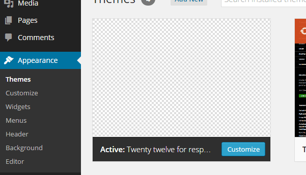
Once you have added the style.css you will see the child theme in your admin section as seen below. You can now activate it.

The first thing we will do is make our footer hold widgets so that it becomes easy to customize. To do this in your child theme folder, create a file called functions.php.
In functions.php add the following code:
[php]
<?php function twentytwelvechild_widgets_init() { register_sidebar( array( ‘name’ => __( ‘Footer Widget Area’, ‘twentytwelvechild’ ),
‘id’ => ‘footer-sidebar’,
‘description’ => __( ‘Appears on the footer, which has its own widgets’, ‘twentytwelvechild’ ),
‘before_widget’ => ‘
<div id="%1$s" class="widgetfooter">’,
‘after_widget’ => ‘</div>
‘,
‘before_title’ => ‘
<h3 class="widget-title">’,
‘after_title’ => ‘</h3>
‘,
) );
}
add_action( ‘widgets_init’, ‘twentytwelvechild_widgets_init’ );
[/php]
In the above code we are hooking in the ‘widgets_init’ hook of WordPress which is called during the initialization of the widgets.In the function twentytwelvechild_widgets_init we register the widget area for the footer using the function register_sidebar with the id as footer-sidebar.
Now create a file called footer.php in your child theme folder and add the following code to it:
[html]
</div>
<!– #main .wrapper –>
<footer id="footer">
<?php if ( is_active_sidebar( ‘footer-sidebar’ ) ) : ?>
<div class="footer-widget-area" >
<?php dynamic_sidebar( ‘footer-sidebar’ ); ?>
</div>
<?php endif; ?>
</footer>
</div>
<!– #page –>
<?php wp_footer(); ?>
</body>
</html>
[/html]
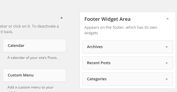
In the above code we are checking that the sidebar (i.e. the widget area) is active and if it is active we are showing the widgets using the function dynamic_sidebar and passing it the id as ‘footer-sidebar’. At the bottom don’t forget to call the wp_footer(); function as shown in the code above. Once you have overridden the footer.php as shown above you should be able to see the footer-sidebar widget area in your admin as follows. You should add widgets to it.

Now that we have added widgets to the footer we will be able to see them in the footer area. The problem with that is we want footer widgets to be seen differently when on a big screen like a laptop and when viewed on a small screen like a mobile device. Footer widgets should be next to one another when the screen is big but should be below one another on smaller screens. We are going to achieve this using media queries. In your style.css file add the following code:
[css]
.widgetfooter {
float: left;
width: 30%;
padding-top: 5px;
padding-bottom: 20px;
}
.widgetfooter ol, ul {
padding-left: 20px;
list-style: circle;
}
/* Mobiles in Potrait mode */
@media only screen
and (max-width : 320px) {
.widgetfooter {
float: left;
width: 100%;
padding-top: 5px;
padding-bottom: 20px;
}
}
/* Mobiles in landscape mode */
@media only screen
and (min-width : 321px)
and (max-width : 480px) {
.widgetfooter {
float: left;
width: 100%;
padding-top: 5px;
padding-bottom: 20px;
}
}
[/css]
In the above css by default we have kept the widgetfooter to float right and span 30 percent of the available space. So the widgets would stack on the right of the previous widget on bigger screen as shown below.

But as the screen would get smaller these would be difficult to read and hence it would be better to stack the widgets one below the other. To achieve this we have added media queries that when the screen is small like that of the mobile device the width of the widget becomes 100 percent and they are stacked one below the other as shown below.

As the horizontal space on smaller screens is less we generally show more content vertically. This makes the user scroll vertically quite a lot. Therefore, it is nice to add a link in the footer that takes the user directly to the top of the page. To do that you will need to identify one div on your page which indicates the top of the page. In my theme it is main div. Then update the code in your footer.php of the child theme as follows:
[html]
</div>
<!– #main .wrapper –>
<footer id="footer">
<?php if ( is_active_sidebar( ‘footer-sidebar’ ) ) : ?>
<div class="footer-widget-area" >
<?php dynamic_sidebar( ‘footer-sidebar’ ); ?>
</div>
<?php endif; ?>
<div id="footerlink">
<a href="#main">Go back to the top</a>
</div>
</footer>
</div>
<!– #page –>
<?php wp_footer(); ?>
</body>
</html>
[/html]
Add add the following style to your style.css of the child theme:
[css]
#footerlink {
float: left;
width:100%;
text-align:center;
padding-bottom: 20px;
}
[/css]
In the above code we added a link in the footer that scrolls to the top. We kept the link in the center of the div so that it will be visible and easily accessible even on smaller screens. Now if you see your footer you will see the link to scroll up in the center of the footer as shown below:

The footer is the most neglected area of website real estate. The footer, if used appropriately, can display important content and increase usability of a site. While designing and adding content to the footer of your WordPress site make sure that the footer is responsive so that it’s visible and readable on smaller screens. The footer can also be used to provide small features like adding a link to scroll back on top which will enhance the usability of the site by a lot on smaller screens. Have fun designing a responsive footer for your WordPress site.