Ask a coding agent for a settings page and it has to pick a color for the save button, a size for the heading and a gap between the fields. It will pick something every time. The question is whether it picks from your list or from its memory of every other site.
A design token is how you hand it the list. A token is a design value with a name: primary: "#963614", md: 16px. This guide is about choosing and naming them well when the reader is an agent. What is a DESIGN.md covers the file they live in.
Name the job, not the look
There are two ways to name a color. blue-500 says what it looks like. primary says what it is for.
A person can work with either, because a person remembers that the buttons are blue-500. An agent starts each task knowing only what is written down. The name is its whole instruction:
- A look name answers nothing.
blue-500,blue-600andindigo-500are all plausible for a button. The agent has to guess, and two tasks will guess differently. - A role name is the rule.
primaryis the main action.surfaceis a card.on-primaryis the text on the main action. There is one right answer, and it is in the name. - A role survives a change of value. In the Kiln theme
primaryis#963614on the light page and#EC8B5Eon the dark one. Code that saysbg-primaryis right in both. Code that says a terracotta is wrong in one.
The names 23 themes use
We counted the color names in all 23 DESIGN.md files in the repo (the script parses each with lintSpec from @strictthemes/spec). There are 38 distinct names.
| Used by | Names |
|---|---|
| All 23 themes | background, surface, foreground, neutral, border, primary, on-primary, secondary, on-secondary, tertiary, on-tertiary, error |
| 7 themes | success |
| 1 theme each | 25 names, such as glaze-pale, heat-low, lagoon and on-lagoon, ring |
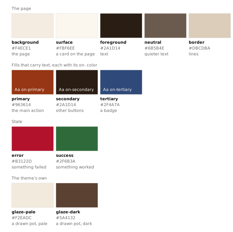
So a working palette is twelve roles: five for the page (background, surface, foreground, neutral, border), three fills each with its text color, and error. The smallest theme has exactly those 12 colors, the largest has 18, and the median is 13.
The 25 one-off names are worth a look, because they bend the rule. Some are named for a thing in the product: Kiln's glaze-pale and glaze-dark color a drawn pot, Ember's heat-low, heat-mid and heat-high are a three-step scale for meters and chart bars. Others are plain hue names, such as Tideline's lagoon and coral, which fill large blocks. A hue name is acceptable for a brand color that has no single job, as long as the prose says where it goes and it comes with an on- color if text sits on it. Tideline does both.
The on- pair
on-primary is the color of text and icons placed on primary. Every fill that carries text gets one. This convention does two things.
It removes a decision. An agent that puts a label on a secondary button does not choose between foreground, white and background. It uses on-secondary. The skill that Strict Check generates for a project states it as a rule:
Put text on a fill only in that fill's
on-color; a fill without one is not for text.
It also makes contrast checkable before anything is built. Contrast is a ratio from 1:1 (no difference) to 21:1 (black on white), and WCAG level AA asks for 4.5:1 for normal text. A linter cannot know which of 15 colors will meet which. With pairs, it knows exactly which to test.
We measured every pair in the 23 themes, in light and dark mode: 77 pairs, 154 measurements. The lowest is 4.64:1 and the median is 9.25:1. None is under 4.5:1, and 32 are under 7:1, the AAA level. Kiln's on-primary on primary is 6.93:1.
Compare a pairing nobody declared. Kiln's tertiary blue as text on its primary terracotta is 1.19:1, which is unreadable. Nothing in the token list forbids it except the missing pair. Contrast for non-designers goes through the thresholds.
Scales are closed lists
A scale is a short, ordered list of allowed sizes. Spacing, text sizes and corners each get one.
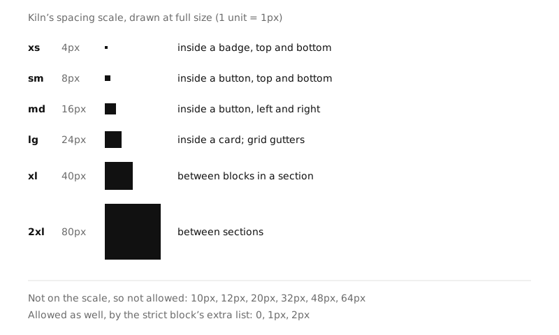
The point of a scale for an agent is that it is closed. "Use consistent spacing" is not checkable. "Padding, margin and gap are 4, 8, 16, 24, 40 or 80px" is: 12px is wrong, and a tool can say so. Without the list an agent reaches for the values it has seen most, and those are some other project's scale.
What the 23 themes do:
| Scale | How many steps | Which values |
|---|---|---|
| Spacing | 6 in 21 themes, 5 in one, 7 in one | 4px and 8px in all 23. Then 16px (16 themes), 24px (14), 12px (11), 48px (9), 32px (8). The largest step runs from 48px to 128px. |
| Text sizes | 5 in all 23 | Body is 16px in 9 themes, 17px in 7, 15px in 4, 18px in 3. Labels are 12px in 13 and 13px in 8. |
| Corners | 3 in 22 themes, 1 in one | 17 distinct values across the themes, from 0 to 28px. Corners are where themes differ most. |
Two things follow. The small end of a spacing scale is settled: 4 and 8. The large end is a design choice, and it is what makes one theme feel dense and another airy. And five text sizes is enough for a whole site: a display size, two headings, body and label.
Each text size is a full style. In these files a size carries its own weight, line height and letter spacing, so an agent cannot set a 38px heading with body line height.
How many is enough
A real page uses far more values than a token list holds. To see how many, we ran this on three public home pages:
npx @strictthemes/check generate https://the-site.example
The command opens the page in the browser on your machine, counts every color, text size and spacing value at 1280px, keeps the ones that carry most of the page and lists the rest under "To settle by hand".
| Home page of | Colors: kept, left out | Text sizes: on the page, kept | Spacing sizes: kept, left out | Values that follow the kept set |
|---|---|---|---|---|
| A large framework | 6, 3 | 10, 5 | 8, 9 | 91.3% of 2,787 |
| A developer platform | 18, 6 | 13, 5 | 8, 11 | 93.5% of 2,591 |
| A non-profit | 8, 3 | 8, 5 | 8, 5 | 94.9% of 1,746 |
On the first page, the five text sizes left out were used 3, 2, 2, 1 and 1 times. The pattern is the same on all three: a small set does more than 90% of the work, and a long tail of values appears once or twice. The tail is where an agent's one-off choices end up. A token list is the small set, written down, with the tail declared out of bounds.
These are three pages on one day, measured at one width in one color mode. They show the shape, not a law.
Tokens that stay the same in dark mode
A dark mode in a DESIGN.md is a list of overrides: only the colors it names change. A color it leaves out keeps its value.
That is sometimes what you want. Kiln's dark mode overrides 13 of 15 colors and leaves the two glaze colors alone. Its prose gives the reason: "a pot does not change color when the page does". In 21 of the 23 themes tertiary is also the same in both modes.
Decide this per token and write it down. An agent that sees a color missing from the dark list cannot tell a decision from an oversight unless the prose says which it is. Dark mode with tokens in Tailwind 4 shows the mechanics.
From tokens to classes
Tokens only help if the code uses their names. For Tailwind CSS 4, this prints them as a theme:
npx @strictthemes/spec export DESIGN.md --format tailwind
@theme {
  --color-primary: #963614;
  --color-on-primary: #FFF6EC;
  --color-surface: #FBF6EE;
  ...
  --text-h1: 38px;
  --text-h1--line-height: 1.1;
  --text-h1--font-weight: 700;
  --text-h1--letter-spacing: -0.02em;
  ...
  --radius-lg: 10px;
  --spacing-space-md: 16px;
  ...
}
Tailwind turns each variable into classes. We compiled a few against this theme with Tailwind 4.3.5:
.bg-surface {
  background-color: var(--color-surface);
}
.p-space-md {
  padding: var(--spacing-space-md);
}
.text-h1 {
  font-size: var(--text-h1);
  line-height: var(--tw-leading, var(--text-h1--line-height));
  letter-spacing: var(--tw-tracking, var(--text-h1--letter-spacing));
  font-weight: var(--tw-font-weight, var(--text-h1--font-weight));
}
So the agent writes bg-surface text-foreground, text-h1 and p-space-md, and the token names are the class names. Two traps, both checked with the same Tailwind version:
- Spacing names collide with widths. A variable named
--spacing-mdalso becomes the value ofmax-w-md: with--spacing-md: 16px, Tailwind compiledmax-w-mdtomax-width: var(--spacing-md). That is why the export writes--spacing-space-mdand the class isp-space-md. - The default palette is still there. With Tailwind's own theme loaded beside the export,
bg-blue-500still compiled. Adding--color-*: initial;in a@themeblock removed it, andbg-surfacestayed. Until you do that, the look names are one keystroke away.
The second naming scheme
Many projects already have role names that are not the spec's. shadcn/ui components are written against its own set: card, muted-foreground, destructive. The shadcn export of @strictthemes/spec maps one onto the other, taking the first matching token name in each row:
| shadcn variable | Taken from the spec's | For Kiln |
|---|---|---|
background, foreground |
background, foreground |
#F4ECE1, #2A1D14 |
card, popover |
surface |
#FBF6EE |
primary-foreground |
on-primary |
#FFF6EC |
secondary-foreground |
on-secondary |
#FBF6EE |
muted-foreground |
neutral, when it reads at 4.5:1 on the page and on a card |
#6B5B4E |
destructive |
error |
#B3122D |
border, input |
border |
#DBCDBA |
muted, accent |
No token: mixed from the page or card color and the foreground | #eae2d7, #eae5dd |
tertiary, tertiary-foreground |
tertiary, on-tertiary, as variables of their own |
#2F4A7A, #FBF6EE |
Three places where this goes wrong:
accentis not your accent. shadcn paints hover and highlighted states withaccent, so the export does not put a brand color there. Atertiarytoken becomesbg-tertiary.- Corner names shift. shadcn's
rounded-lgis its base radius, which the export sets fromrounded.md. A larger token moves one name up: Kiln's 10pxlgcorner isrounded-xlin a shadcn project. - Two vocabularies in one prompt. If
DESIGN.mdsayssurfaceand the code saysbg-card, tell the agent which names the code uses. Runningnpx @strictthemes/check --rulesin the project prints both lists, the spec's names first and the shadcn names after.
Pick one scheme for the code and keep to it. Mixed names are how the same grey ends up in a project three times.
What to leave out
- A token used once. One badge in teal is a decision about that badge. Either it is a real state and gets a role name such as
success, or it goes. - Tints and steps "in case". A 50 to 950 ramp per color gives an agent eleven ways to be nearly right. The themes here list each color once.
- Values a rule already covers. Kiln allows
0,1pxand2pxbeside its spacing scale through theextralist in itsstrictblock. They do not need names. - Component sizes. A button's height follows from its text style and padding. Record the pairing as a component, not as a new number.
Next
- What is a DESIGN.md, and what goes in one: where the tokens sit in the file, and the prose that goes with them.
- Make a DESIGN.md from a site you already have: the measurement used above, on your own site.
- The themes: 23 token sets to read or start from.