A coding agent builds a page from whatever it knows about your design. If that is nothing, it uses its own habits: a grey it likes, corners a little too round, a 14px that is not yours. If it is a paragraph in a chat message, the paragraph is gone by the next session.
A DESIGN.md is where the design lives between sessions. It is one Markdown file in the project's root, and it has two readers. An agent reads it before it builds. A program reads it afterwards and checks what was built. This guide takes one real file apart, says how big such a file should be, and ends with a small one to copy.
One file, two halves
The format was published by Google Labs in 2026 and is marked alpha. Strict uses it as it is and adds one key, strict, which is covered below.
The file starts with front matter: a block of YAML between two --- lines, the same device a blog post uses for its title and date. Here it holds tokens. A token is a design value with a name, such as primary: "#963614". After the front matter comes ordinary Markdown: up to eight sections of prose that say what the tokens are for.
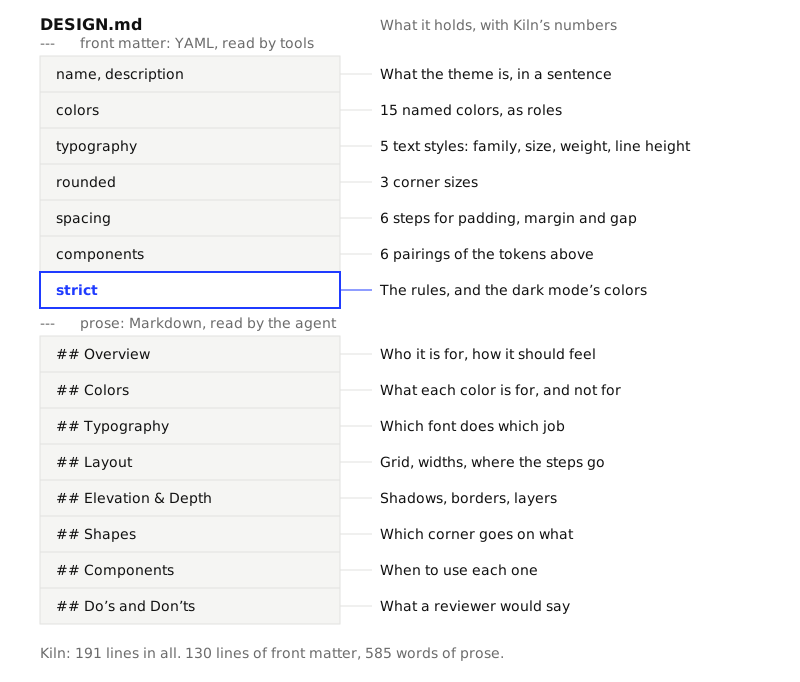
The halves do different work. The tokens say what may be used, and a program can read them. The prose says when and why, and only a reader that understands sentences can use it. A file with tokens alone gives you an agent that uses the right terracotta on everything.
The token groups
The examples below are from Kiln, one of the 23 themes in the repo, at packages/themes/themes/kiln/DESIGN.md.
colors
Each color is named for its job, not its look. Kiln has 15. These are five of them:
colors:
  primary: "#963614"
  on-primary: "#FFF6EC"
  background: "#F4ECE1"
  surface: "#FBF6EE"
  foreground: "#2A1D14"
primary is the fill of the main action. on-primary is the color of text placed on that fill. background is the page, surface is a card laid on the page, foreground is the text. Design tokens for coding agents explains why the names matter more than the values.
typography
A typography token is a whole text style, not a size alone:
typography:
  h1:
    fontFamily: Bricolage Grotesque
    fontSize: 38px
    fontWeight: 700
    lineHeight: 1.1
    letterSpacing: -0.02em
Kiln has five: display, h1, h2, body and label. Keeping the weight and line height with the size stops an agent from pairing a 38px heading with body line height.
rounded and spacing
Two short lists of lengths. rounded is corner sizes. spacing is the steps allowed for padding, margin and gap.
rounded:
  sm: 2px
  md: 4px
  lg: 10px
spacing:
  xs: 4px
  sm: 8px
  md: 16px
  lg: 24px
  xl: 40px
  2xl: 80px
components
A component here is not code. It is a named pairing of the tokens above, written as references in curly brackets:
components:
  button-primary:
    backgroundColor: "{colors.primary}"
    textColor: "{colors.on-primary}"
    typography: "{typography.label}"
    rounded: "{rounded.md}"
    padding: "{spacing.sm} {spacing.md}"
This is the part a linter can test. It knows which text goes on which fill, so it can work out the contrast between them before any page exists.
The eight sections
All eight are optional. The ones you write must come in this order, and a few have a second accepted name (Brand & Style for the first, Layout & Spacing for the fourth).
| Section | What belongs in it | From Kiln |
|---|---|---|
| Overview | Who the product is for and how it should feel | "warm, plain and sure of itself" |
| Colors | What each color is for, and where it must not go | Denim blue is for a badge, "never for large areas" |
| Typography | Which font does which job | "Labels are sentence case, never uppercase" |
| Layout | Grid, widest width, where each spacing step goes | "80px between sections, 24px inside a card" |
| Elevation & Depth | Shadows, borders, how layers are told apart | "Flat, like printed card" |
| Shapes | Which corner size goes on what | "No pills, no circles except avatars" |
| Components | When to use each component | Terracotta "for the one main action" |
| Do's and Don'ts | What a reviewer would say | "Don't use pure black or pure white" |
Notice what the right-hand column has in common. None of it can be derived from the hex values. It is the half of the design that used to live in a designer's head.
The strict block
A plain DESIGN.md describes. The strict block turns the description into rules: it says how closely the built UI has to follow the tokens. This is Kiln's, without its dark mode colors:
strict:
  version: 1
  contrast: AA
  colors:
    allow: tokens
    tolerance: 0.02
  spacing:
    allow: scale
    extra: ["0", "1px", "2px"]
  rounded:
    allow: scale
    full: 64px
  typography:
    allow: scale
    fonts: declared
  tells:
    purple-gradient: error
    emoji-icons: error
    nested-cards: warn
    glow-shadows: error
| Line | What it means |
|---|---|
contrast: AA |
Text needs 4.5:1 against what is behind it. AAA asks for 7:1. |
colors.allow: tokens |
Only the listed colors may appear. tolerance is how far a color may drift from one and still count. |
spacing.allow: scale |
Padding, margin and gap come from the spacing tokens, plus the values in extra. |
rounded.full: 64px |
The largest box that may be fully round. Kiln's prose allows avatars, so this lets them through. |
typography |
Only the declared sizes, weights, line heights and font families. |
tells |
Signs of generic machine-made UI, each set to off, warn or error. |
modes |
Extra color modes. Kiln's dark mode overrides 13 of its 15 colors. |
A file without the block is still valid. The defaults then apply: AA contrast, token colors only, scale-only spacing, corners and type. A tool that does not know Strict sees strict as an unknown key, which the format treats as a warning. The spec page has every field.
How big a good file is
We ran one script over all 23 themes in the repo. It parses each file with lintSpec from @strictthemes/spec and counts.
| Median | Smallest | Largest | |
|---|---|---|---|
| Colors | 13 | 12 | 18 |
| Typography tokens | 5 | 5 | 5 |
| Spacing steps | 6 | 5 | 7 |
| Corner sizes | 3 | 1 | 3 |
| Components | 6 | 6 | 6 |
| Words of prose | 521 | 414 | 664 |
| Lines in the file | 184 | 177 | 191 |
Three things to take from it:
- The file is short. Under 200 lines, about two thirds of them front matter. An agent can read the whole thing at the start of every task.
- The prose is about 500 words. That is one page of writing. If yours is 50 words, the agent is guessing at intent. If it is 5,000, you have written a style guide, and the rules that matter are buried.
- The counts barely vary. Every theme has exactly five text styles and six components. Twelve colors is the floor because all 23 files share the same twelve names. The themes with more added colors of their own, such as Kiln's two glaze colors for drawn pots.
All 23 files have a dark mode. 22 ask for AA contrast and one, Civic, asks for AAA.
Lint it
The linter tells you whether the file is well formed and whether its own components are readable. Run it on Kiln:
npx @strictthemes/spec lint kiln/DESIGN.md
info     orphaned-tokens  colors
         Colors no component refers to: border, error, success, glaze-pale, glaze-dark
info     token-summary
         15 colors, 5 typography, 3 rounded, 6 spacing, 6 components, 1 extra modes

kiln/DESIGN.md: 0 errors, 0 warnings
The info lines are notes, not faults. Now a copy broken on purpose in two places: on-primary changed to a pale terracotta, #E8B79E, and the Typography section moved above Colors.
error    contrast-ratio  components.button-primary
         #E8B79E on #963614 has a contrast ratio of 4.13:1, below WCAG AA (4.5:1)
warning  section-order  Colors
         Section "Colors" is out of order. Expected order: Overview, Colors, Typography, Layout, Elevation & Depth, Shapes, Components, Do's and Don'ts
info     orphaned-tokens  colors
         Colors no component refers to: border, error, success, glaze-pale, glaze-dark
info     token-summary
         15 colors, 5 typography, 3 rounded, 6 spacing, 6 components, 1 extra modes

broken/DESIGN.md: 1 errors, 1 warnings
The command exits with code 1, so it can stop a commit or a CI job. The contrast error exists only because button-primary names its fill and its text. A color pair that no component uses is not tested, which is a reason to write components even if you never read them again. Contrast for non-designers explains the 4.5:1.
The same file, as code and as a page
The tokens are data, so they convert. This prints Kiln as a Tailwind CSS 4 theme (shortened here):
npx @strictthemes/spec export DESIGN.md --format tailwind
@theme {
  --color-primary: #963614;
  --color-on-primary: #FFF6EC;
  ...
  --text-h1: 38px;
  --text-h1--line-height: 1.1;
  --text-h1--font-weight: 700;
  --text-h1--letter-spacing: -0.02em;
  ...
  --radius-md: 4px;
  --spacing-space-md: 16px;
  ...
}

.dark {
  --color-primary: #EC8B5E;
  --color-on-primary: #2A1206;
  ...
}
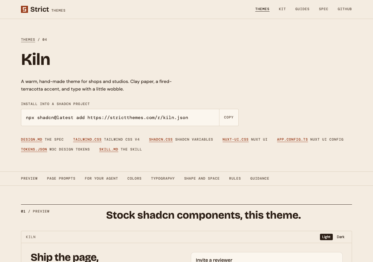
The other formats are shadcn, shadcn-css, nuxt-ui and dtcg (the W3C design tokens JSON). The theme pages on this site are drawn from the same file: the swatches, the type samples, the rules and the guidance on Kiln's page all come out of its DESIGN.md.
A small one to copy
This file is 45 lines and lints with 0 errors and 0 warnings. Change the values and the sentences to yours.
---
name: Plainsong
description: A quiet theme for a small product site.
colors:
  primary: "#1D4ED8"
  on-primary: "#FFFFFF"
  background: "#FFFFFF"
  surface: "#F4F4F2"
  foreground: "#18181B"
  neutral: "#5F5F66"
  border: "#DADAD6"
typography:
  h1: { fontFamily: Inter, fontSize: 36px, fontWeight: 700, lineHeight: 1.15 }
  body: { fontFamily: Inter, fontSize: 16px, fontWeight: 400, lineHeight: 1.6 }
  label: { fontFamily: Inter, fontSize: 13px, fontWeight: 500, lineHeight: 1.3 }
rounded: { sm: 2px, md: 6px }
spacing: { xs: 4px, sm: 8px, md: 16px, lg: 32px, xl: 64px }
components:
  button-primary:
    backgroundColor: "{colors.primary}"
    textColor: "{colors.on-primary}"
    typography: "{typography.label}"
    rounded: "{rounded.md}"
    padding: "{spacing.sm} {spacing.md}"
  card: { backgroundColor: "{colors.surface}", textColor: "{colors.foreground}", rounded: "{rounded.md}", padding: "{spacing.md}" }
  page: { backgroundColor: "{colors.background}", textColor: "{colors.foreground}", typography: "{typography.body}" }
  caption: { backgroundColor: "{colors.surface}", textColor: "{colors.neutral}", typography: "{typography.label}" }
strict:
  version: 1
  contrast: AA
  tells: { purple-gradient: error, emoji-icons: error }
---

## Overview

A product site for people who want the facts fast. Calm, plain, one blue.

## Colors

Blue is for the one main action on a view. Grey text is for captions only.

## Do's and Don'ts

- Do keep one primary button per view.
- Don't add a color, size or corner that is not a token above.
The linter prints three notes for it: five sections are not present, border is used by no component, and the token counts. None stops it passing. It has no dark mode, and it is missing most of its prose. Treat it as the skeleton to fill, not a finished theme.
What the file cannot do
- It does not enforce itself. The linter checks the file. Whether a page follows it is a second job, done by Strict Check against the code and the rendered pages.
- Nothing checks the prose. "One primary button per view" is read by the agent and by you. The tools check the numbers, not the sentences.
- It does not load fonts. The file names font families. Every export ends each family in a generic fallback, and the project still has to add the font files.
- It is not loaded on its own. An agent reads it only if something tells it to. DESIGN.md, AGENTS.md and Cursor rules covers where that instruction goes.
Next
- The spec format: every field, every lint rule and what each export writes.
- Design tokens for coding agents: how to choose and name the tokens that go in the front matter.
- Make a DESIGN.md from a site you already have: measure a live site instead of writing the file by hand.