The slow way to build dark mode is to visit every element and add a second class: text-gray-600 dark:text-gray-300, a few hundred times. A coding agent does this readily, and misses some. The ones it misses are invisible until someone opens the page at night.
The other way has no second class. A component says what role a color plays, such as text-muted-foreground, and the role has one value in light and another in dark. The switch happens in one place, in CSS. A role with a value is a token.
This guide sets that up in Tailwind 4 and checks it. Every snippet was compiled with Tailwind 4.3.5 in a new Vite project, and the results were read back from the browser.
1. Define the tokens as CSS variables
Write each role once under :root for light, and again under .dark:
:root {
  --page: #F4ECE1;
  --ink: #2A1D14;
  --line: #DBCDBA;
}

.dark {
  --page: #1A130E;
  --ink: #F1E6D8;
  --line: #3B2D22;
}
This is plain CSS and needs no framework. Any element inside something with the class dark sees the second set.
Name tokens for what they do, not for how they look. --ink can be dark brown in one mode and cream in the other. --dark-brown cannot.
2. Map them into Tailwind with @theme inline
Tailwind 4 has no JavaScript config for colors. A variable named --color-<name> inside an @theme block creates the classes bg-<name>, text-<name>, border-<name> and the rest:
@import "tailwindcss";

@theme inline {
  --color-page: var(--page);
  --color-ink: var(--ink);
  --color-line: var(--line);
}
The word inline matters. We compiled both forms and read the output:
Compiled bg-page |
A .dark wrapper around part of the page |
|
|---|---|---|
@theme inline |
background-color: var(--page) |
goes dark |
@theme |
background-color: var(--color-page) |
stays light |
Without inline, Tailwind writes --color-page: var(--page) once on :root, where --page is the light value, and everything below inherits that result. With the class on <html> both forms work. With it on a preview pane, a card or one section, only inline does.
3. Add the dark variant
You still need dark: now and then, for something that is not a color swap: a different image, a shadow that should go away. Out of the box, Tailwind 4 compiles dark:underline inside @media (prefers-color-scheme: dark), so it follows the system setting and ignores your class. One line ties it to the class instead:
@custom-variant dark (&:is(.dark *));
This is the line a new shadcn project has in src/index.css. With it, the compiled selector is .dark\:underline:is(.dark *).
Keep dark: rare. The stock shadcn button has nine dark: classes for small adjustments, such as dark:bg-input/30. The 558-line shop page in this site's registry has none. A page that needs many is a sign that a token is missing.
4. Switch the class, and honor the system setting
Tokens under .dark follow the class, not the system. We set the browser to prefer dark and loaded the page from step 2: it stayed light. Something has to put the class there. A script in the <head>, before the page paints, does it:
<script>
  const saved = localStorage.getItem("theme")
  const dark = saved ? saved === "dark" : matchMedia("(prefers-color-scheme: dark)").matches
  document.documentElement.classList.toggle("dark", dark)
</script>
With this, a browser set to dark got class="dark" on <html> and the dark colors, and one set to light got neither. A toggle button then writes "dark" or "light" to localStorage under the same key and flips the class.
A new shadcn project on Vite ships a ThemeProvider component that does the same from React: it defaults to the system setting, listens for changes to it, and remembers a choice.
5. Check both modes
A dark mode is half of your site, and it is the half nobody looks at during the day. The rest of this guide is about checking it: first what to expect, then three mistakes and a command that finds them.
What actually changes between modes
It is tempting to think dark mode swaps the page and the text and leaves the rest. We counted, across the 23 themes in this project. Each theme's DESIGN.md lists its light colors and then the ones that differ in dark. A script read all of them with lintSpec from @strictthemes/spec and compared the two modes:
| Measure | Count |
|---|---|
| Color tokens across 23 themes | 308 |
| Change in dark | 236 (76.6%) |
| Stay the same | 72 |
| Tokens that stay, in the median theme | 2 |
By role:
| Role | Themes where it changes |
|---|---|
background, foreground, surface, border, neutral, error |
23 of 23 |
primary |
22 of 23 |
secondary |
22 of 23 |
on-primary (the text on a primary fill) |
21 of 23 |
tertiary |
3 of 23 |
Two things stand out.
The brand color changes. primary is lighter in dark mode in 22 of the 23 themes, and darker in none. One theme, Relay, keeps both its primary and the text on it.
What stays is a fill with its own text. tertiary is the same in both modes in 20 themes, and its text color on-tertiary in 21. In Strict One, for example, it is a signal color for one badge: a fill with its own text on it, so the pair carries its contrast wherever it sits. The same goes for the fixed colors some themes add: Kiln's two glaze colors are for a drawing of a pot, and "a pot does not change color when the page does", as its DESIGN.md puts it.
So the rule of thumb: a color that touches the page must change with the page. A color that only touches its own partner may stay.
Why dark needs its own colors
Contrast is how far apart two colors are in brightness, as a ratio from 1:1 to 21:1. WCAG, the accessibility standard, asks for 4.5:1 for normal text at level AA and 3:1 for large text. Here is Kiln, computed with the contrastRatio function from the spec package:
| Pair | Light | Dark | Light value left on the dark page |
|---|---|---|---|
foreground on background |
13.96 | 14.91 | 1.12 |
neutral (quiet text) on background |
5.55 | 7.61 | 2.83 |
primary on background |
6.33 | 7.37 | 2.48 |
on-primary on primary |
6.93 | 7.09 | 2.33 |
error on background |
5.90 | 8.38 | 2.66 |
The last column is what a forgotten token costs. The terracotta that reads at 6.33 on clay paper reads at 2.48 on dark brown. So dark gets a lighter primary, #EC8B5E. But cream text on that lighter orange is 2.33, so on-primary has to flip to a dark brown as well. One change forces the next. That is why the on- colors exist as separate tokens: the text on a fill is not "white", it is whatever passes on that fill in that mode.
Three mistakes, and what they look like
We built a small page with the Kiln theme and made the three classic mistakes on purpose.
| Mistake | Class in the code | Fix |
|---|---|---|
| A palette grey for quiet text | text-gray-600 |
text-muted-foreground |
| The brand color written as a value | text-[#963614] |
text-primary |
| A border made of faint black | border-black/10 |
border-border |
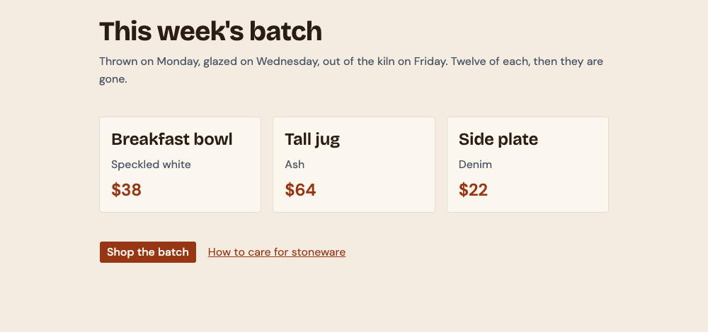
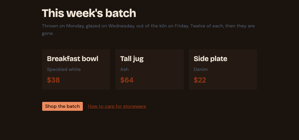
Then we built it and ran Strict Check, with the theme's DESIGN.md in the project root:
npm run build
npx -y @strictthemes/check@0.7.1 --dist dist
Rendered pages: / in light and dark mode at 1280px and 375px, also on hover and focus
  colors         114 checked  16 off
  ...
  contrast        60 checked  16 off
  ...

Warnings in the source (2)
  color-hard-coded  ×2
    #963614 is a theme color written out by hand, so it will not change with the color mode. Use the theme's class or variable for it.
    src/App.tsx:28; src/App.tsx:35
  color-hard-coded
    `border-black` is a theme color written out by hand, so it will not change with the color mode. Use the theme's class or variable for it.
    src/App.tsx:24

Errors on the rendered pages (5)
  color-off-token  ×4
    Text color #4A5565 is not one of the Kiln colors.
    p.text-body.text-gray-600 "Thrown on Monday, glazed on Wedn"; ...  [light, dark; 1280px, 375px]
  contrast  ×3
    Text is 2.25:1 against its background; WCAG AA needs 4.5:1.
    p.text-body.text-gray-600 "Speckled white"; p.text-body.text-gray-600 "Ash"; p.text-body.text-gray-600 "Denim"  [dark; 1280px, 375px]
  contrast  ×3
    Text is 2.30:1 against its background; WCAG AA needs 3:1 for large text.
    p.text-h2.text-[#963614] "$38"; p.text-h2.text-[#963614] "$64"; p.text-h2.text-[#963614] "$22"  [dark; 1280px, 375px]
  contrast
    Text is 2.43:1 against its background; WCAG AA needs 4.5:1.
    p.text-body.text-gray-600 "Thrown on Monday, glazed on Wedn"  [dark; 1280px, 375px]
  contrast
    Text is 2.48:1 against its background; WCAG AA needs 4.5:1.
    a.text-body.text-[#963614].underline "How to care for stoneware"  [dark; 1280px, 375px]

Failed: 94.7% of 703 measured values follow the theme. 6 errors, 2 warnings.
Read the square brackets. The grey is off the theme in [light, dark], because it is not a Kiln color in either. Every contrast error says [dark] alone. The same text passes contrast in light, so a check that only opens light mode, or a person who only looks in daylight, would find nothing.
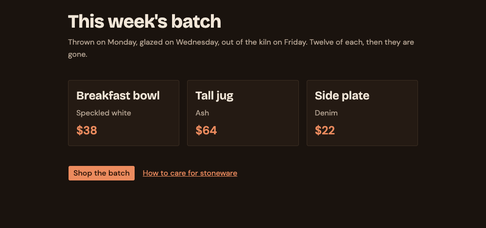
After the three one-word fixes:
Passed: 100% of 698 measured values follow the theme. 0 errors, 0 warnings.
Getting the tokens out of a DESIGN.md
If your design lives in a DESIGN.md, the spec package writes steps 1 and 2 for you, in two shapes:
npx -y @strictthemes/spec@0.1.0 export DESIGN.md --format tailwind
@theme {
  --color-primary: #963614;
  --color-on-primary: #FFF6EC;
  ...
  --color-background: #F4ECE1;
  --color-surface: #FBF6EE;
  ...
}

.dark {
  --color-primary: #EC8B5E;
  --color-on-primary: #2A1206;
  ...
  --color-background: #1A130E;
  ...
}
npx -y @strictthemes/spec@0.1.0 export DESIGN.md --format shadcn-css
:root {
  ...
  --background: #F4ECE1;
  ...
  --card: #FBF6EE;
  ...
  --primary: #963614;
  --primary-foreground: #FFF6EC;
  ...
}

.dark {
  --background: #1A130E;
  ...
  --card: #241A13;
  ...
  --primary: #EC8B5E;
  --primary-foreground: #2A1206;
  ...
}
tailwind |
shadcn-css |
|
|---|---|---|
| For | A Tailwind 4 project without shadcn | A project that has shadcn's @theme inline block |
| Names | The DESIGN.md names: bg-surface, text-on-primary |
shadcn's names: bg-card, text-primary-foreground |
| How dark works | .dark overrides the --color-* values themselves |
.dark overrides the plain variables that @theme inline points at |
The first shape puts real values in @theme and overrides them under .dark, so it has no need for inline. We compiled it with the @custom-variant line from step 3: bg-background came out as var(--color-background) and changed under the class, on <html> and on a wrapper.
What this does not cover
- The border was only a warning. The vanished card border shows up as
color-hard-codedin the source check. The rendered check measures text contrast, and in this run reported nothing about the border on the page itself. Look at borders with your own eyes in dark. - Images and shadows are not tokens. A photo with a white background, a logo in dark ink, a soft grey shadow: these need their own handling, and here
dark:is the right tool. - A flash of the wrong mode. We did not measure whether a page shows light for a moment before the class is set. That risk is why the script in step 4 sits in the
<head>, ahead of the content. - Two modes means two checks, always. Any screenshot, review or test that covers one mode covers half the site.
Next
- Contrast for non-designers: what 4.5:1 means and how to read the numbers above.
- Design tokens for coding agents: why role names beat palette names when an agent writes the code.
- Install a shadcn theme: the
:rootand.darkblocks arriving in a real project, as a diff.