Ask a coding agent for "a pricing page" and you get the pricing page: three cards, the middle one lifted and glowing, a purple button, check marks in green circles. It is not wrong. It is the average of every pricing page the model has seen, and yours now looks like everyone's.
Two things change that. A theme decides the values: which colors, which text sizes, which spacing steps. A page prompt decides the rest: what the sections are, how they are laid out, and which token goes where. This guide shows both at work on one page type in three themes, with the measurements, so you can judge whether the approach is worth using and run it yourself.
The three pages
Each of the 23 Strict themes has five page prompts. We take three themes whose prompts include a page about what something costs:
| Theme | Made for | Its pricing page | Prompt |
|---|---|---|---|
| Strict One | Software products, editorial sites | Pricing: three plans, a monthly and yearly switch, a comparison table, a FAQ | 5,061 words |
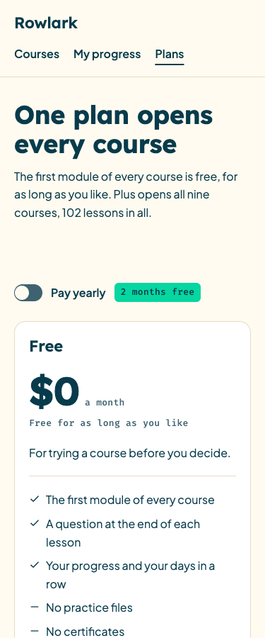
| Primer | Courses, schools, learning tools | Plans: three plans, a yearly switch, a comparison, questions | 6,702 words |
| Solace | Therapists, coaches, private practices | Fees: a table of session fees, cancelling and paying, questions | 7,568 words |
The word counts are of the prompt as the site serves it, counted with curl -s <address> | wc -w. They are long on purpose, and the next section says what the words are spent on.
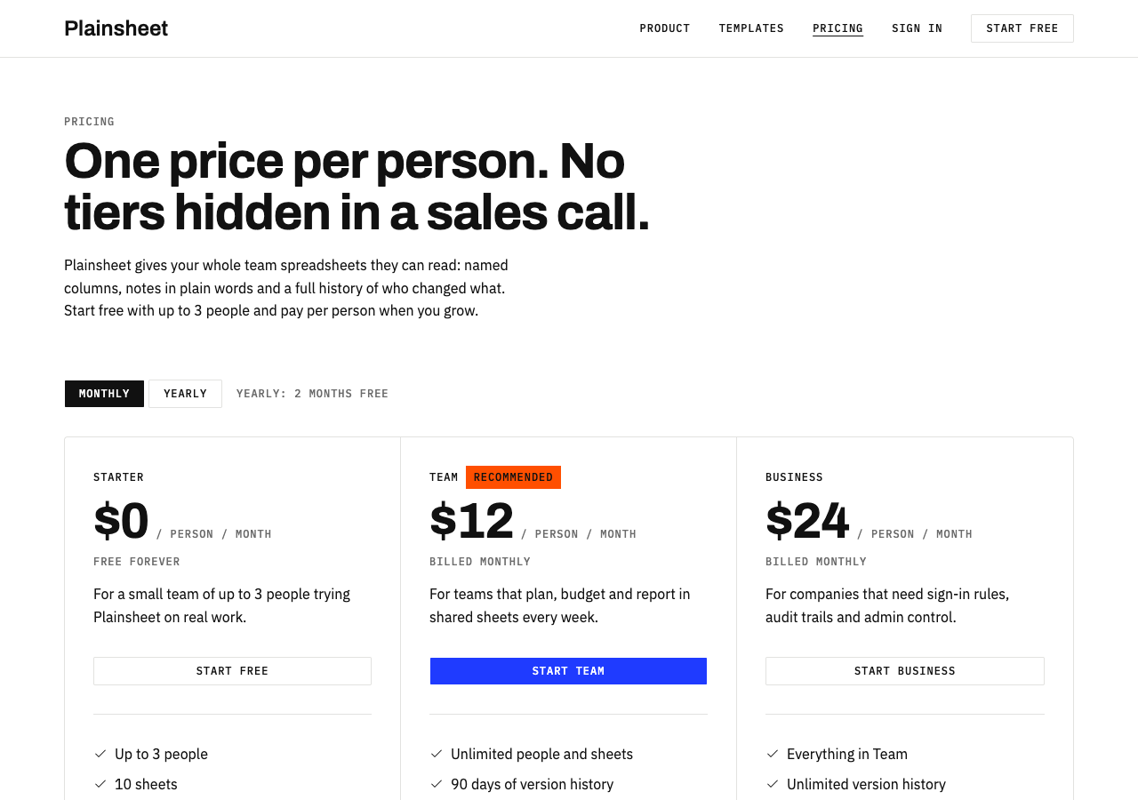
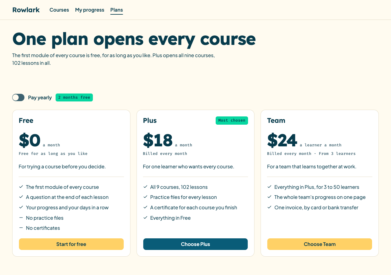
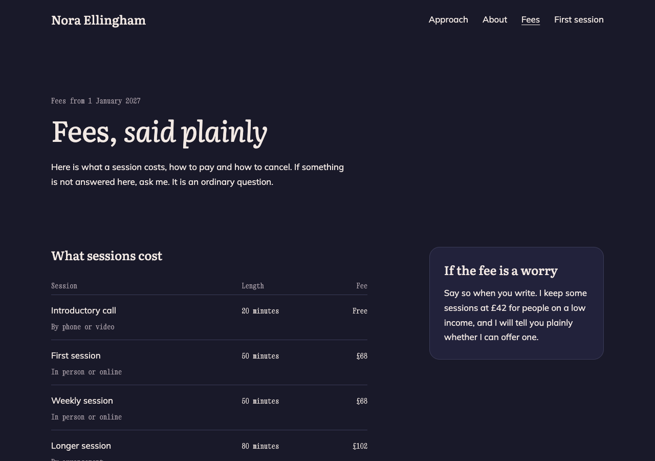
The third page is the one to look at. Solace has no "recommended plan", because its prompt was written for someone who charges by the session. The same request, "what does it cost", gets a different page because the theme knows who it is for.
What a page prompt contains
Open one: the Strict One pricing prompt. It has five parts.
| Part | What it does | Example from the prompt |
|---|---|---|
| Before you start | Makes sure the theme is installed and the agent has read DESIGN.md |
"If not, run npx shadcn@latest add https://strictthemes.com/r/strict-one.json" |
| The theme in short | Repeats the tokens, with the class for each | "Spacing scale, with the Tailwind step in brackets: 4px (1), 8px (2), 16px (4), 32px (8), 64px (16)" |
| The page | Each section in order: content, layout, classes | "three plans side by side... columns divided by 1px borders, not floating cards" |
| Rules | What is allowed, in terms an agent can apply | "No arbitrary values such as p-[18px], and no other steps such as p-3 or gap-6" |
| Check before you finish | A list the agent goes through against its own code | "Exactly one plan is marked as recommended, and it has the only default (primary) button in the plan row" |
Three things in it do most of the work.
It names the default and forbids it. "Columns divided by 1px borders, not floating cards." "Do not enlarge the plan, lift it or tint its background." An agent told only what to do drifts back to the average. Told what not to do, it stays.
It gives the class, not the wish. Not "generous spacing" but "p-8". Not "a large price" but "font-heading text-display". Every value in the prompt is one the theme has, so following the prompt and following the theme are the same act.
It knows where the stock components break the theme. For example: "The stock Accordion is off the type scale. Pass items-center gap-4 rounded-none py-4 font-sans text-body font-medium in the trigger's className." Lines like this come from measuring test builds: the stock accordion sets a text size of its own, and Strict One has no such size. A prompt written from memory would not have them.
What was measured
Every example page on the site was checked with Strict Check, and the result is kept beside it. For these three:
| Page | Values measured | On the theme | Errors | Warnings |
|---|---|---|---|---|
| Strict One, pricing | 6,632 | 100% | 0 | 0 |
| Primer, plans | 5,099 | 100% | 0 | 0 |
| Solace, fees | 4,400 | 100% | 0 | 0 |
A "value" is one measured property of one element: a text color, a font size, a padding, a corner, a contrast ratio. The check opens the built page in light and dark mode, at 1280px and 375px.
We also measured what each built page uses, with the same measuring code the check has (measurePages from @strictthemes/check), at 1280px in light mode:
| Strict One | Primer | Solace | |
|---|---|---|---|
| Text sizes | 12, 16, 24, 36, 56 | 13, 16, 22, 56 | 14, 17, 24, 56 |
| Spacing values | 4, 8, 16, 32, 64 | 4, 8, 12, 20, 32, 80 | 8, 16, 28, 48, 112 |
| Corners | 2, 4 | 6, 10, 16, and a pill | 12, 20 |
| Colors of text and fills | 5 | 7 | 4 |
| Fonts | Archivo, IBM Plex Sans, IBM Plex Mono | Lexend, Plus Jakarta Sans, Fira Code | Literata, Mulish, Xanh Mono |
Read a column down and you have that theme's character in numbers. Strict One doubles: 4, 8, 16, 32, 64, with corners you can barely see. Solace starts at 8 and reaches 112, with 20px corners: slow and roomy. Primer sits between.
Now read across. Not one page has a sixth text size or a stray padding. That is the claim of this whole project in one table: the page uses a short, closed list of values, and a tool can confirm it.
For comparison, when we measured the home pages of three public sites while testing the generator, one of them used 12 text sizes and 23 spacing values on a single page.
Light, dark and a phone
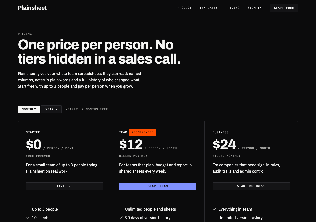
No page has a dark: color class in its code. The prompt forbids them: "Because every color comes from a semantic class, this needs no extra code." The theme's colors change under the dark class and the page follows.
Run it in your project
You need a project with shadcn set up. A new one from the shadcn CLI works.
1. Install the theme
npx shadcn@latest add https://strictthemes.com/r/strict-one.json
This writes the theme's colors, fonts and corners into your CSS. Install a shadcn theme shows exactly which files change.
2. Give your agent the prompt
Copy the prompt from its address and paste it as your request, with a line about your own product on top:
https://strictthemes.com/themes/strict-one/prompts/pricing.md
Add what is yours: the product name, the real plans and prices, the real questions. The prompt says what to do with them: "If the user gave you details about their product, use them. Otherwise use the sample product in this brief."
An agent connected to the themes' MCP server can fetch the prompt itself. Connect it to https://mcp.strictthemes.com/mcp and ask for "a pricing page in the Strict One theme".
3. Check what it built
npm run build
npx @strictthemes/check --dist dist
The last line of the report starts with Passed or Failed. If it failed, give the report back to the agent: each line names the element, the value, and what the theme allows instead.
4. Look at it
The check measures values. It does not know whether the page is good. Open it at phone width, tab through it with the keyboard, switch the billing period, read the copy. The prompt's own list under "Check before you finish" is a fair review list for you as well.
What this does not give you
- Your page. The samples are a made-up spreadsheet product, a made-up course site and a made-up therapist. The layout is the theme's; the content has to be yours.
- A guarantee on a different model or tool. A prompt is text, and tools read text differently. The prompts are kept to what has been run and measured; they have not been run in every coding tool.
- A page type that is not there. Each theme has five prompts. For a sixth kind of page, the theme's skill and its
DESIGN.mdstill hold the values, but the layout is yours to describe. - Taste. A page can follow every rule and still be dull. The rules remove the common ways of looking generated. They do not add an idea.
Next
- All 23 themes, each with its five page prompts and what each produces.
- AI slop in UI: the tells, and how to check for them: what the prompts are steering away from.
- Keep an agent on your design: Strict Check in CI: run the same check on every pull request.