"AI slop" is the name people give to output that was generated and never looked at. In UI it has a look you can spot from across the room: a purple gradient, a rocket emoji, three rounded cards in a row, everything centered. The page works. It also looks like every other page made the same way.
This guide names ten tells, says where each comes from, and separates the ones a program can measure from the ones that need a person. To have something real to measure, we wrote a small page that contains all ten on purpose, ran Strict Check on it, fixed it, and ran the check again. The page is ours and made up for this guide. It is nobody's real site.
Why agents produce the same page
A coding agent with no design to follow still has to pick a color, a size and a radius for every element. It picks the likeliest one. The likeliest value is the one that appears most often in the code it learned from, and that is a narrow set: a utility framework's default palette, its default text sizes, its largest shadow, the landing-page layout of a thousand templates.
Two things follow from that.
- The tells are defaults, not choices. Nobody decided the button should glow. Nothing said it should not.
- Each element is decided alone. The agent picks a grey for this caption without checking what grey the last caption got. That is how one page ends up with seven of them.
So the cure is not "have better taste". It is to give the agent a short list of allowed values, and to check the result against the list.
The ten tells
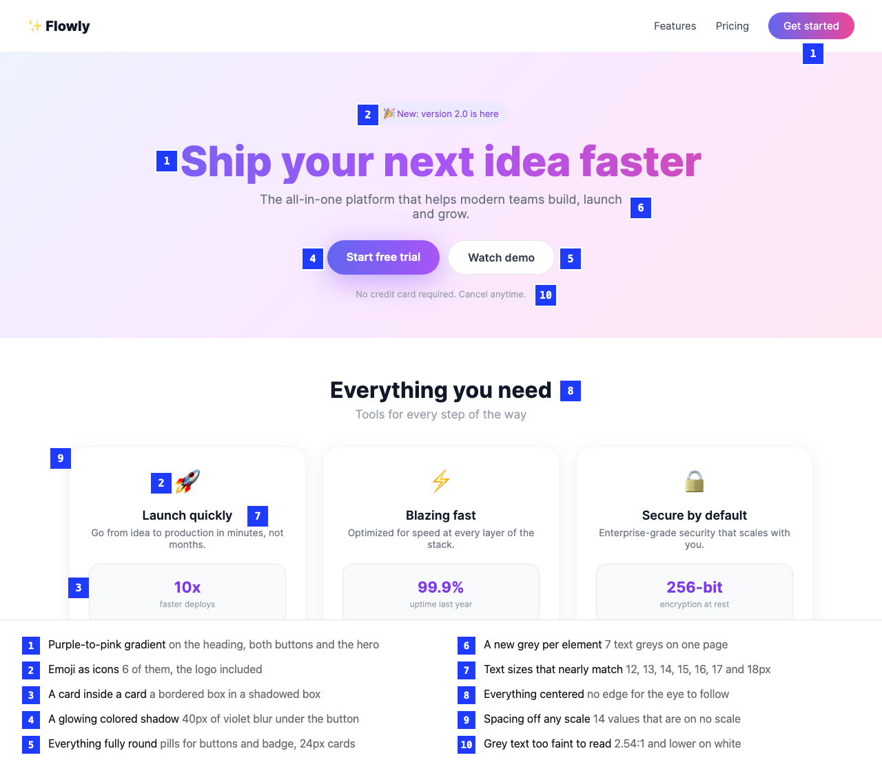
| # | Tell | What it looks like | Where it comes from |
|---|---|---|---|
| 1 | Purple-to-pink gradient | Indigo, violet and pink blended on the heading, the buttons, the hero | The default palette's most-used accent, plus "make it pop" |
| 2 | Emoji as icons | A rocket for "fast", a lock for "secure", sparkles in the logo | No icon set installed, and an emoji needs no import |
| 3 | Cards inside cards | A bordered box inside a shadowed box | Every group of content gets a container, at every level |
| 4 | Glowing colored shadows | A soft violet blur under the main button | The largest shadow preset, tinted with the accent |
| 5 | Everything fully round | Pill buttons, pill badges, 24px cards | "Friendly" read as "round", applied to all of it |
| 6 | A new grey per element | Body, caption, hint and border each in their own grey | Each element decided alone |
| 7 | Text sizes that nearly match | 13, 14, 15, 16 and 17px on one screen | The same, for type: no scale to pick from |
| 8 | Centered everything | Every heading, paragraph and card centered | The template layout. It needs no decision about alignment |
| 9 | Off-scale spacing | 14px here, 18px there, 22px next to it | Padding tuned by eye, one element at a time |
| 10 | Low-contrast grey text | Light grey captions on white | Pale grey reads as "elegant" in a mockup and fails on a real screen |
One tell alone proves nothing. A real designer may use a gradient. The look comes from several at once, and from the sameness under them: tells 6, 7 and 9 are one fault, a page with no system, seen in color, type and space.
What a machine can measure, and what it cannot
Nine of the ten can be measured once you have a list of allowed values to compare against. That list is the job of a DESIGN.md: one file with the project's colors, text sizes, spacing steps and corners, and a strict block that says only those are allowed. Strict Check reads that file and checks two things: the source code as text, and the built page in a headless browser, where it reads what the browser computed for every visible element.
This is how each tell is detected. We read it from the check's source, evaluate.ts, collect.ts and source.ts.
| Tell | Rule | How it is measured |
|---|---|---|
| Gradient | tell-gradient |
Source: any gradient class or linear-gradient( in a style, whatever its colors. Rendered: a gradient background whose stops include a hue of 280° to 330° in OKLCH (a color space built to match how the eye sees hue), or whose stops are more than 40° of hue apart. Stops with a chroma under 0.04, near-greys, are ignored. |
| Emoji | tell-emoji |
Any character that shows as an emoji by default, in a component's source or in an element's own text. |
| Nested cards | tell-nested-cards |
Rendered only. A card is a box at least 160px by 80px, with a border on all four sides or a shadow, and with rounded corners or a shadow. One inside another is reported. |
| Glow | tell-glow |
Rendered only. A box or text shadow whose color has a chroma above 0.04. A grey shadow is not a glow. |
| New greys | color-off-token |
Every text, background, border and outline color has to be one of the spec's colors, within a small tolerance. |
| Close text sizes | type-off-scale |
Every font size has to be one of the spec's sizes. |
| Off-scale spacing | spacing-off-scale |
Every padding, margin and gap has to be a step of the spacing scale. |
| Too round | radius-off-scale |
Every corner has to be one of the spec's radii. A box whose radius is half its shorter side or more is a "full round" and passes only up to the size the spec allows. |
| Faint text | contrast |
Text against the color behind it: 4.5:1, or 3:1 for large text, at WCAG AA. |
The four tell- rules are switched on by the spec. All 23 themes in this repo set purple-gradient and emoji-icons to error. All but Strict One set glow-shadows to error, and all but Recital set nested-cards to warn. The scales are short on purpose: every one of the 23 has exactly five text sizes, five to seven spacing steps and one to three corner sizes. (Counted with a script over the themes' strict blocks.)
Centering is the one in the list with no rule at all. More on that below.
The check, run on the page
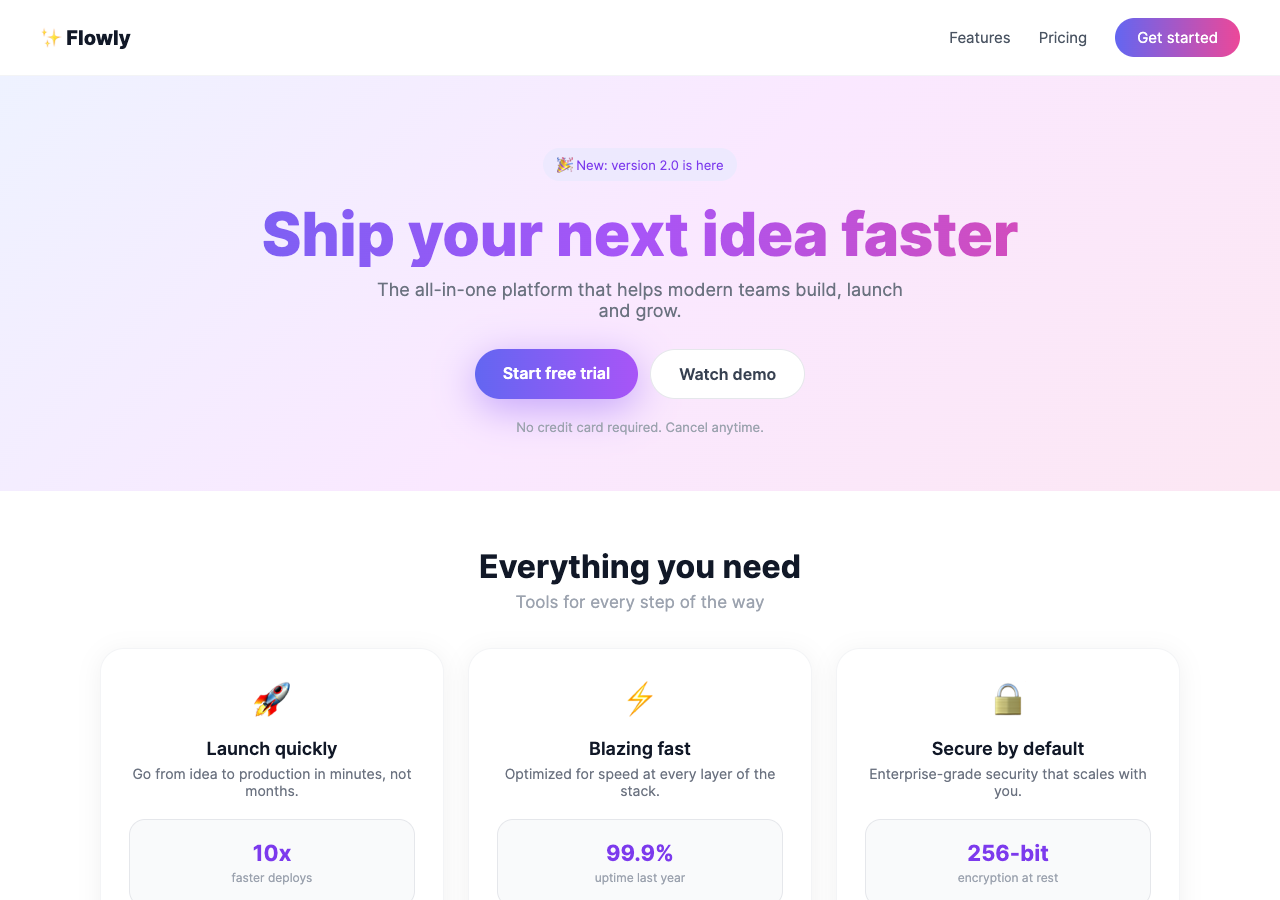
The page is plain HTML and one stylesheet, in a folder site, with the Strict One theme's DESIGN.md beside it. Strict One allows twelve colors, five text sizes (12, 16, 24, 36, 56px), five spacing steps (4, 8, 16, 32, 64px) and corners of 0, 2 and 4px.
npx @strictthemes/check@0.7.1 . --dist site
The report is 293 lines. This is the summary and one line of each kind, with the rest cut:
Strict Check: Strict One

Source code
  colors          38 checked  38 off
  typography       1 checked  1 off
  tells           10 checked  10 off

Rendered pages: / in light and dark mode at 1280px and 375px, also on hover and focus
  colors          90 checked  52 off
  spacing        158 checked  158 off
  typography     178 checked  108 off
  corners         20 checked  12 off
  contrast        44 checked  10 off
  tells           82 checked  26 off
  layout           2 checked  all on theme
  states          10 checked  all on theme

Errors in the source (24)
  tell-gradient  ×4
    A CSS gradient. Strict One does not allow purple or multi-color gradients; use a flat theme color.
    site/styles.css:8; site/styles.css:10; site/styles.css:12; site/styles.css:16
  color-off-token  ×3
    #9ca3af is not one of the Strict One colors.
    site/styles.css:18; site/styles.css:22; site/styles.css:30
...
Errors on the rendered pages (54)
...
  spacing-off-scale  ×4
    A padding of 28px is not on the spacing scale (0, 1, 4, 8, 16, 32, 64px).
    a.button.glow "Start free trial"; a.button.ghost "Watch demo"; article.card; footer.footer  [light; 1280px, 375px]
  type-off-scale  ×3
    Text is 15px, which is not in the type scale (12, 16, 24, 36, 56px).
    a "Features"; a "Pricing"; a.pill "Get started"  [light; 1280px, 375px]
  contrast
    Text is 2.54:1 against its background; WCAG AA needs 4.5:1.
    p.sub "Tools for every step of the way"  [light; 1280px, 375px]
  radius-off-scale
    Corner radius is 24px, which is not one of the theme's corners (0, 2, 4px).
    article.card  [light; 1280px, 375px]
...
Warnings on the rendered pages (6)
...
  tell-glow
    A colored shadow or glow, which Strict One asks to avoid.
    a.button.glow "Start free trial"  [light; 1280px, 375px]
  tell-nested-cards
    A card inside a card, which Strict One asks to avoid. Separate the inner content with a border or space instead.
    div.card.inner  [light; 1280px, 375px]

Failed: 34.4% of 633 measured values follow the theme. 78 errors, 11 warnings.
Among the lines cut are six tell-emoji errors, one for each emoji, which this page does not print. The numbers that describe the page best: all 158 measured spacing values were off the scale, in 14 different sizes, and the text used seven greys and twelve sizes where the theme has five sizes and one grey for quiet text.
What it missed
Read the report against the picture and four things are absent. This is the part to remember when a check says "passed".
- The pill buttons passed. Strict One's prose says nothing is pill-shaped except avatars, but its
strictblock allows a full round up to 64px across, and a 50px-tall button is under that. Only the 24px and 16px card corners were reported. The check enforces thestrictblock, not the prose. - The pale hero gradient passed the rendered check. Its three stops have a chroma of 0.018 to 0.036, under the 0.04 line, so the browser pass saw greys. The source check did report it, because it flags any gradient in a stylesheet.
- Text on a gradient is not checked for contrast. The check cannot name one color behind such text, so it skips it. The faint line under the hero buttons is as weak as the ones that were reported, and is not in the list. The gradient headline is skipped too.
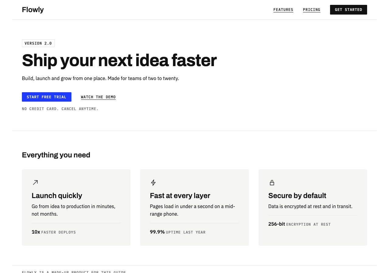
- Centering is not a rule. We centered every line of the fixed page and ran the check again: 100%, no warnings.
Two smaller ones. In a first draft the inner box was about 70px tall and was not counted as a card, because of the 80px floor; we made it taller to show the rule. And four near-white greys such as #f3f4f6 were treated as the theme's own colors, because they sit within the color tolerance of one. They got a warning for being written by hand, not an error.
The same page, held to the theme
The fix changed no content structure: the same header, hero, three features and footer. The stylesheet now starts with the theme's tokens as CSS variables, and nothing after that block names a color or a size of its own. Emoji became three line icons. The inner boxes became a line of text above a 1px border. Text aligns to the left edge of the grid.
Rendered pages: / in light and dark mode at 1280px and 375px, also on hover and focus
  colors         218 checked  all on theme
  spacing        304 checked  all on theme
  typography     640 checked  all on theme
  corners         36 checked  all on theme
  contrast       128 checked  all on theme
  tells          128 checked  all on theme
  layout           4 checked  all on theme
  states          20 checked  all on theme

Passed: 100% of 1478 measured values follow the theme. 0 errors, 0 warnings.
It measured more than twice as many values as before, mostly because the fixed page has a dark mode and the first one did not. The "Source code" section of this report is empty. The source check reads class names and colors written by hand; in plain CSS it does not read padding: 14px. With a stylesheet that only holds the theme's variables it had nothing to count. On a Tailwind project it has much more to say, since p-3 and text-sm are class names.
Passing does not make the page good. It makes it consistent, and it removes the ten defaults. Whether the headline says anything is still yours to judge.
Train the eye too
A check removes defaults. It cannot tell you what to put in their place, and neither can a list of rules. That comes from looking at a lot of designed work and asking why each choice was made: why this page has one accent and that one has none, why the heading is left-aligned, how much space separates two sections.
A habit that works: once a week, pick one page you admire and write down its text sizes, its spacing steps and its colors, the way a DESIGN.md would. You will find a short list every time. For a steady supply of pages and the reasoning behind them, design publications help; Designmodo's articles cover web and email design with examples, and its yearly trend pieces are a quick way to see what the field is moving toward and away from.
A review checklist that needs no tool
Open the page next to this list. Each line takes a few seconds.
- Count the accent colors. More than one, or a blend of two, on a page that has no brand reason for it.
- Look for a gradient on text, buttons or the hero. Ask what it is for.
- Search the source for emoji. Each one is either content or a missing icon.
- Find a border inside a border. If a box sits in a box, one of them can become space or a single line.
- Look under the main button. A colored blur is a glow.
- Squint at the corners. If buttons, badges, inputs and cards are all pills or all very round, nobody chose.
- Pick the greys with the browser's inspector. Three is plenty: text, quiet text, border. Write down any more.
- List the font sizes. Two sizes one or two pixels apart are one size that drifted.
- Read the paddings in the inspector. They should repeat: 8, 16, 32. A 14 or an 18 is a guess.
- Read the smallest grey text at arm's length, in daylight. If it is hard, it fails.
- Find the left edge. If nothing lines up down the page, everything is centered.
- Read the copy. "All-in-one platform for modern teams" is the same default, in words.
Lines 11 and 12 are the ones no check here does for you.
Next
- Contrast for non-designers: what 4.5:1 means and how to fix a pair that fails.
- Keep an agent on your design: Strict Check in CI: run this check on every pull request.
- The themes: 23 specs with the tells already switched off.