A coding agent writes Bootstrap fluently and generically. Ask for a pricing page and you get the blue of btn-primary, 6px corners and mb-3 under everything. The page works, and it looks like every other Bootstrap page.
A DESIGN.md is one file that lists a project's colors, text sizes, spacing steps and corners, and says which values are allowed. The other guides here wire it into Tailwind. This one holds a Bootstrap 5 project to it. @strictthemes/spec has no Bootstrap export (its formats are tailwind, shadcn, shadcn-css, nuxt-ui and dtcg), so the mapping is done by hand, and this guide is that mapping.
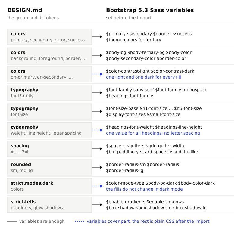
We did it for real: Bootstrap 5.3.9 and Sass 1.108.2 from npm, the Kiln theme as the spec, and one page with a navbar, buttons, three cards, badges, a table and a form. Every variable below was found in node_modules/bootstrap/scss/_variables.scss.
1. Set Bootstrap's variables from the tokens
Bootstrap's variables are all declared !default, so a value you set before the import wins. The file has three parts:
// scss/custom.scss
// 1. Bootstrap's variables, set from DESIGN.md
$primary: #963614;
// ...
// 2. Bootstrap
@import "bootstrap/scss/bootstrap";
// 3. Plain CSS for what no variable reaches
npx sass --load-path=node_modules --quiet-deps --silence-deprecation=import,global-builtin scss/custom.scss dist/app.css
Colors
| Token | Bootstrap variable | Why it needs setting |
|---|---|---|
primary |
$primary, $link-color, $component-active-bg |
The default is #0D6EFD. |
secondary, error, success |
$secondary, $danger, $success |
|
tertiary |
A new key in the $theme-colors map |
Gives .btn-tertiary and .text-bg-tertiary. |
background, foreground |
$body-bg, $body-color, $body-emphasis-color |
Emphasis text is pure black by default. |
surface |
$body-tertiary-bg, $body-secondary-bg |
|
neutral |
$body-secondary-color |
The default is the body color at 75%. |
border |
$border-color, $border-color-translucent |
Cards use the second: black at 17.5%. |
Write $theme-colors out with only the roles the spec has. With info, warning, light and dark left out, .btn-warning and .text-bg-info are no longer compiled, so nobody can reach for them.
Text on fills. A spec names the text color for each fill: on-primary goes on primary. Bootstrap computes it. Its color-contrast() function tries $color-contrast-light, then $color-contrast-dark, then white, then black, and returns the first that reaches $min-contrast-ratio, which is 4.5 by default. So there is one light and one dark text color for every fill. Kiln's three pairs use two light colors: #FFF6EC on primary, #FBF6EE on secondary and tertiary. Set the two variables to the spec's lightest on- color and its foreground. That is close, and step 3 makes it exact.
Hover. A hovered button is its fill mixed with 15% black ($btn-hover-bg-shade-amount). A mix is not a token. We set the eight $btn-hover-* and $btn-active-* amounts to 0%, so a hovered button keeps its fill.
Type
| Token | Bootstrap variable | Value for Kiln |
|---|---|---|
| Body font | $font-family-sans-serif |
"DM Sans", system-ui, sans-serif |
| Heading font | $headings-font-family, $display-font-family |
"Bricolage Grotesque", ... |
| Label font | $font-family-monospace, $btn-font-family |
"DM Mono", ... |
body 16px |
$font-size-base, $line-height-base |
1rem, 1.6 |
h1 38px |
$h1-font-size |
2.375rem |
h2 24px |
$h2-font-size, $h3-font-size |
1.5rem |
display 60px |
$display-font-sizes |
(1: 3.75rem) |
label 12px |
$small-font-size, $font-size-sm, $btn-font-size, $badge-font-size |
.75rem |
A spec like Kiln has five sizes. Bootstrap has six headings, six .display-* sizes, .lead, .small and -lg variants of buttons and fields. Trim them:
- Set
$h4-font-sizeto$h6-font-sizeto the body size, and$lead-font-sizeand$font-size-lgtoo. - Give
$display-font-sizesone entry, so only.display-1exists. - Set
$enable-rfs: false. Bootstrap's responsive font sizes shrink large text as the window narrows: the stock page's 48px heading measured 30.675px at 375px wide. A closed list of sizes cannot hold that.
Spacing, corners, shadows
$spacers is the map behind p-1 to p-5. Four of Bootstrap's five steps already match Kiln's scale: 4, 8, 16 and 24px. The fifth is 48px. Replace the map so the classes are the scale:
$spacers: (0: 0, 1: .25rem, 2: .5rem, 3: 1rem, 4: 1.5rem, 5: 2.5rem, 6: 5rem);
// A gutter is split in half on each side of a column
$gutters: (0: 0, 1: .5rem, 2: 1rem);
$grid-gutter-width: 1rem;
$container-padding-x: 3rem;
The grid needs care. Bootstrap halves a gutter and puts one half on each side of a column, so its default 24px gutter measures as 12px paddings, which is off the scale. Sideways a g-* class uses half its value and downwards the whole of it, so $gutters (declared in _maps.scss) holds only values that are on the scale both ways.
Components carry their own paddings, in rem: a button is 6px by 12px, a badge is .35em by .65em. Each has a variable: $btn-padding-y, $btn-padding-x, $input-padding-y, $badge-padding-y, $card-spacer-y, $navbar-brand-padding-y and so on.
Corners are four lines: $border-radius (4px), $border-radius-sm (2px), $border-radius-lg (10px), and $card-border-radius: $border-radius-lg. $enable-shadows and $enable-gradients are already false, but .shadow-sm still casts a shadow. Setting $box-shadow, $box-shadow-sm and $box-shadow-lg to none makes those classes do nothing.
Our file sets 131 variables. Changing that many blind is slow, and a theme builder helps here. bootstrap.build is one: its home page describes a free, open-source tool where you edit Bootstrap's Sass variables in the browser with a live preview, then export Sass or compiled CSS, with no account. Its builder lists the variables in the groups of _variables.scss, including the dark mode colors. Any tool of this kind has to do two things: recompile a page of components when a variable changes, and hand back the variables as a file. Running sass --watch beside a page of your own does the same.
2. Make the dark mode follow the browser
Bootstrap 5.3 switches color modes with data-bs-theme="dark" on <html>. Strict Check switches them by setting the browser's color scheme and the class dark. The two do not meet. Compiled that way, our page got this:
Warnings on the rendered pages (1)
  mode-not-applied
    The page looks the same in dark mode: its background is still #F4ECE1. The check sets a `dark` class on <html> and the browser's color scheme. If the page has no dark mode, pass --mode light.
One variable fixes it. $color-mode-type: media-query compiles the dark rules into @media (prefers-color-scheme: dark), and the check then measured both modes. If your site needs the attribute for a toggle, keep it and set it from the browser's scheme with a script in the <head>. We tested that as well, and both modes were measured:
<script>
  const scheme = matchMedia("(prefers-color-scheme: dark)")
  const apply = () => document.documentElement.setAttribute("data-bs-theme", scheme.matches ? "dark" : "light")
  apply()
  scheme.addEventListener("change", apply)
</script>
Then set the dark values. The spec's strict.modes.dark colors go to $body-bg-dark, $body-color-dark, $body-secondary-color-dark, $body-tertiary-bg-dark, $border-color-dark and $link-color-dark.
That covers the page, its text and its borders. It does not cover the fills. Bootstrap has no $primary-dark: .btn-primary is compiled with the light value and keeps it. Kiln's primary goes from #963614 to #EC8B5E in dark mode, so this needs CSS, in step 3.
Set a component color to one of Bootstrap's CSS variables, not to a hex value. Our first try had $card-bg: #FBF6EE, and the cards stayed pale on the dark page, with text at 1.14:1. $card-bg: var(--bs-tertiary-bg) follows the mode.
3. Run Strict Check
First the stock page, against the spec:
npx @strictthemes/check --dist dist --no-source
Strict Check: Kiln

Rendered pages: / in light and dark mode at 1280px and 375px, also on hover and focus
  colors        1132 checked  580 off
  spacing       1536 checked  476 off
  typography    1826 checked  824 off
  corners        146 checked  134 off
  contrast       410 checked  2 off
  ...
Failed: 64.9% of 5756 measured values follow the theme. 35 errors, 5 warnings.
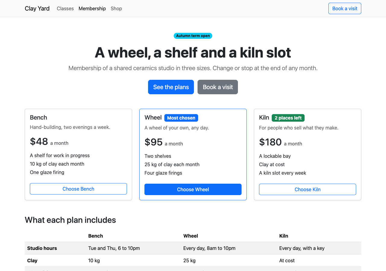
The report is a list of Bootstrap's defaults, measured:
| What | Stock Bootstrap on this page | Kiln allows |
|---|---|---|
| Text sizes | 14, 15, 20, 28, 32, 48px. At 375px wide also 23.05, 24.575 and 30.675px | 12, 16, 24, 38, 60px |
| Paddings | 5, 5.25, 6, 9.75, 12, 36, 48px | 0, 1, 2, 4, 8, 16, 24, 40, 80px |
| Corners | 6px on buttons, cards, badges and fields. 8px on .btn-lg |
0, 2, 4, 10px |
| Font | system-ui, in 106 places |
The three declared |
| Hover and focus | Fills #0B5ED7 and #5C636A, a field border #86B7FE, a button ring #3184FD |
Tokens only |
| Contrast | The outline button on the grey navbar is 4.27:1 | 4.5:1 |
With the variables of steps 1 and 2 and nothing else, the same page scored 93% of 5,548 values, with 14 errors and 7 warnings. What was left is what variables cannot say. It took 49 lines of plain CSS after the import. The whole file is custom.scss, 278 lines with the variables. Most of the plain CSS, shortened:
// Each size is a whole style. Bootstrap has one weight and one line height
// for all headings, and no letter spacing variable at all.
h1, .h1 { letter-spacing: -.02em; }
h2, .h2, h3, .h3 { font-weight: 600; line-height: 1.25; letter-spacing: -.01em; }
small, .small, .form-text, .btn, .badge {
  font-family: $font-family-monospace; font-weight: 500; line-height: 1.3; letter-spacing: .04em;
}

// The fills and their on- colors, again for dark mode
@mixin fill($name, $bg, $on) {
  .btn-#{$name} {
    @include button-variant($bg, $bg, $color: $on, $hover-background: $bg, $hover-border: $bg,
      $hover-color: $on, $active-background: $bg, $active-border: $bg, $active-color: $on, $disabled-color: $on);
  }
  .btn-outline-#{$name} { @include button-outline-variant($bg, $color-hover: $on, $active-color: $on); }
  .text-bg-#{$name} { color: $on !important; }
}
@include color-mode(dark, true) {
  --bs-primary: #EC8B5E;
  --bs-primary-rgb: 236, 139, 94;   // and secondary, tertiary, success, danger
}
@include color-mode(dark) {
  @include fill("primary", #EC8B5E, #2A1206);   // and secondary, tertiary
}

// A button's focus ring is mixed from its text and border colors
.btn { --bs-btn-focus-box-shadow: 0 0 0 2px rgba(var(--bs-primary-rgb), .5); }
// The checkbox is centered by a sum that gave a 4.8px margin
.form-check-input { margin-top: .25rem; }
The fill mixin is also called once for each fill in light mode, which sets the exact on- colors. Two smaller traps: the focus ring of fields is rgba($primary, .25) at compile time, so we set $focus-ring-color: rgba(var(--bs-primary-rgb), .25). And .link-secondary darkens on hover unless $link-shade-percentage is 0. We wrote 0% first, and the hover rule was still compiled, because Bootstrap tests for != 0.
Then the page itself. With the finished stylesheet and the HTML untouched, the check still found 4 errors: text-bg-info no longer exists, so that badge had no fill, and text-bg-success and text-bg-danger put text on colors that have no on- color. We changed 8 lines of HTML: those three badges, g-4 to g-2, a display-5 and a fs-6 taken off, and the prices set in font-monospace.
Strict Check: Kiln

Rendered pages: / in light and dark mode at 1280px and 375px, also on hover and focus
  colors         924 checked  all on theme
  spacing       1436 checked  all on theme
  typography    1922 checked  all on theme
  corners        122 checked  all on theme
  contrast       386 checked  all on theme
  tells          604 checked  all on theme
  layout           4 checked  all on theme
  states          62 checked  all on theme

Passed: 100% of 5460 measured values follow the theme. 0 errors, 0 warnings.
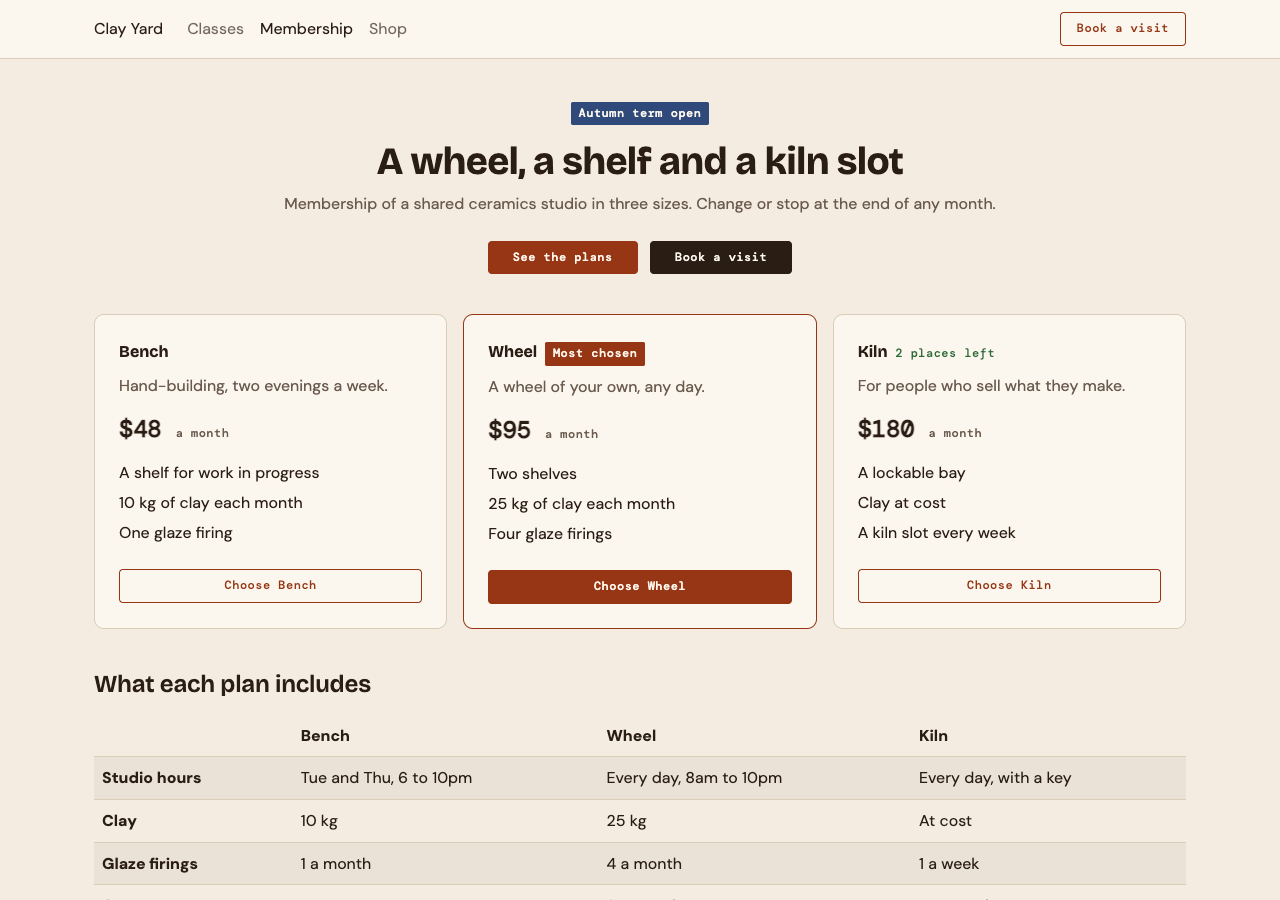
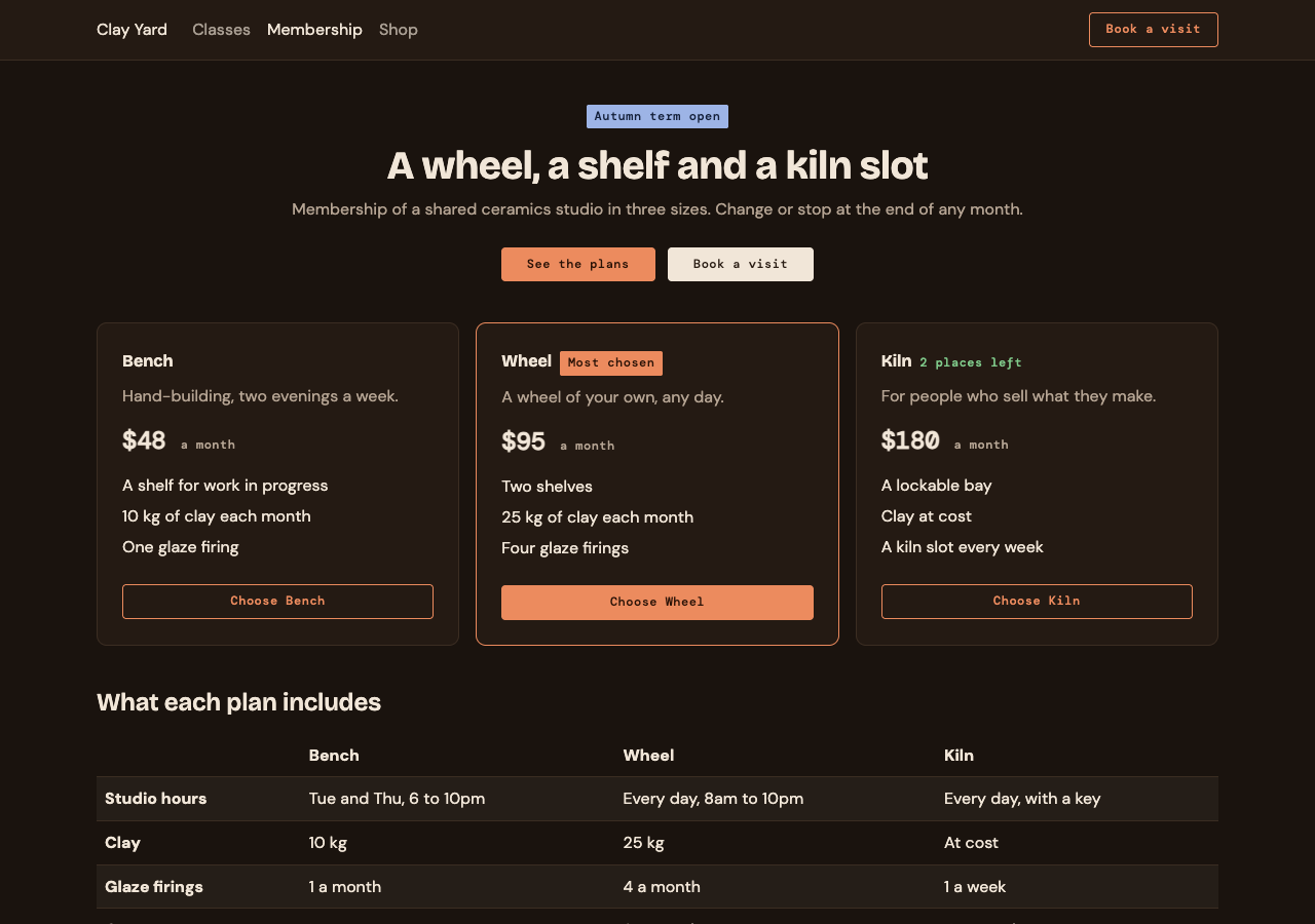
Keep --no-source
Strict Check has a second check that reads source files. It knows Tailwind's class names, not Bootstrap's. Run without --no-source on the passing project, it failed:
Errors in the source (3)
  spacing-off-scale  ×10
    `mb-3` is 12px, which is not on the spacing scale (0, 1, 2, 4, 8, 16, 24, 40, 80px).
  spacing-off-scale  ×3
    `pb-5` is 20px, which is not on the spacing scale (0, 1, 2, 4, 8, 16, 24, 40, 80px).
  ...
Failed: 39.3% of 66 measured values follow the theme. 3 errors, 21 warnings.
In this project mb-3 is 16px and pb-5 is 40px. The 21 warnings are the token values in custom.scss, reported as colors written by hand. In a test file with planted mistakes it did report a font named in a style attribute and a gradient. It did not report bg-info, btn-warning, fs-3, or a hex color and a 13px padding in a style attribute. For a Bootstrap project the rendered check is the one to trust.
4. Tell the agent
Variables remove most wrong values. They do not remove classes that are right in Bootstrap and wrong for the spec. Put the rest in your agent's instruction file (such as AGENTS.md):
## UI rules (Bootstrap 5.3, themed by scss/custom.scss from DESIGN.md)

- Read DESIGN.md before writing UI. Never edit it to make a check pass.
- Spacing: only the utilities 0 to 6 (`p-3`, `mt-5`, `gap-2`). They are 0, 4, 8, 16, 24, 40, 80px.
- Grid gaps: only `g-1` and `g-2`.
- Text: `h1`, `h2`, body text and `.small`. `.display-1` once a page at most. No `fs-*`, no `.lead`.
- Fills: `primary`, `secondary`, `tertiary` only (`btn-*`, `btn-outline-*`, `text-bg-*`).
  `success` and `danger` are for text: `text-success`, `text-danger`.
- No `style` attributes, no hex values, no new CSS outside scss/custom.scss.
- No `rounded-pill`, `rounded-circle`, `shadow*` or `bg-gradient`.
- Components in use: navbar, buttons, cards, badges, tables, forms. Ask before adding another.
- After a change: build, then run `npx @strictthemes/check --dist dist --no-source` and fix what it reports.
What does not map
- One
on-color for each fill. Bootstrap picks text from two colors by contrast. Exact pairs need the mixin above. - Fills in dark mode. There are dark variables for the page, text, borders and links, and none for
$primaryand the other theme colors. - A whole style for each size. One weight and one line height serve all six headings, and nothing sets letter spacing.
- Mixed colors. Hover fills, the button focus ring and the field focus border are computed from other colors. You can turn the mixing off, not point it at a token.
- Halved gutters. A 24px gutter, which Kiln's own prose asks for, is two 12px paddings. We used 16px.
- Components we did not use. Alerts, modals, dropdowns, accordions and the rest have their own variables. Each new one needs its own pass with the check.
- States a script opens. The open navbar menu on a phone, a checked checkbox and a pressed button were not measured. The check forces hover and focus only.
- Prose rules. Kiln's notes ask for a terracotta fill once per screen. Our page has three terracotta buttons and passes: only the
strictblock is checked.
Next
- What is a DESIGN.md, and what goes in one: the file this guide maps from.
- Keep an agent on your design: Strict Check in CI: run the same command on every pull request.
- The themes: 23 specs to map the same way.